Data + Automation + Curation = Useful Architectural Documentation

KEY POINTS:
- This article summarizes my experiences in replacing classical architectural documentation with data-driven architecture documents.
- I present some of my lessons learned in solving the problem of getting a complete, up-to-date picture of critical elements of technology landscapes of big IT organizations.
- Curated data-driven documents generate multiple views on relevant architectural topics based on data sources such as source code, commit history, public cloud billing reports, and finance reports.
- Curation, the act of selecting, organizing, and looking after the data, is the crucial ingredient of the process to prevent creating useless, too detailed views.
The Problem
“I am a mapmaker and a traveler.” Brené Brown
In this article, I present some of my lessons learned in solving the problem of getting a complete, up-to-date picture of critical elements of technology landscapes of big organizations. I mean organizations with hundreds or thousands of developers organized in dozens or hundreds of teams by big organizations. Manual documentation does not scale in such an organizational context.
But, more often than not, big organizations have lots of data that, if used wisely, can provide an excellent basis for architectural documentation. With some automation, and curation, getting a good overview of the technology landscape may be closer than it initially appears.
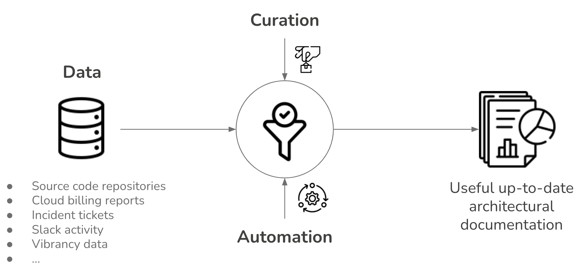
Figure 1: The recipe for data-driven documents: data + automation + curation = useful documentation.
The main inspiration for my work is mapmaking (see Atlas of the Heart for a discussion on a mapmaking metaphor). As noted by Brené Brown, maps are the one of the most important documents in human history. They give us tools to store and exchange knowledge about space and place. While there are differences between maps and layers they show, the one thing that all maps do is provide readers with orientation. A sense of place is central to meaning-making. Maps are also composed from multiple layers. Similalry, the data-driven documents provide layers of data about our systems, describing their size, connections, quality, security, or human activity.
Examples of Data-Driven Architecture Documents
I’ve always aimed to get reliable data about technology with as much as possible automation in my current positions (see Figure 2 for illustrations). Some examples of tools I built and used include:
- Source code contains an incredible amount of information about technology, people activity, team dependencies, and the quality of software systems.
- Public cloud usage reposts (e.g., billing reports), providing overview and trends on which team uses which services, regions, budgets.
- Incident reports, looking at trends and dependencies among incidents.
- Key business metrics, like vibrancy.
- Slack activity to understand team interactions.
In the following sections, I give more details on several of these data-driven documents.
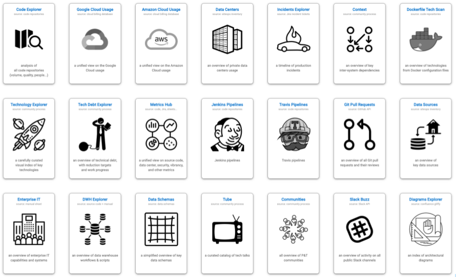
Figure 2: Examples of data-driven architecture documents I’ve built currently use.
Example 1: Source Code and Commit History As A Source of Data
I have repeatably found the source code to be an incredible source for creating data-driven architecture documentation. Source code and commit history include an astonishing amount of information about technology, people activity, team dependencies, and the quality of software systems. I’ve started and still actively maintain the project Sokrates, with the idea to help further extract data from source code that can help my work as an architect. Figure 3 shows some of the insights from source code generated with Sokrates. I use these tools daily, improving them on the way.
In addition to standard source code and commit history analyses (see Apache Software Foundation Sokrates analysis for examples), I also have built several special source code analysis to get further details:
- Travis and Jenkins files analyzers to understand how teams build CI/CD pipelines.
- Dockerfile scan to create a tech radar of runtime technologies.
- GitHub API pull requests analyses to identify deployment frequency.
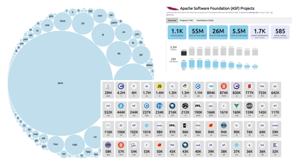
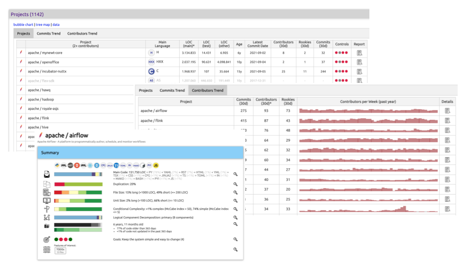
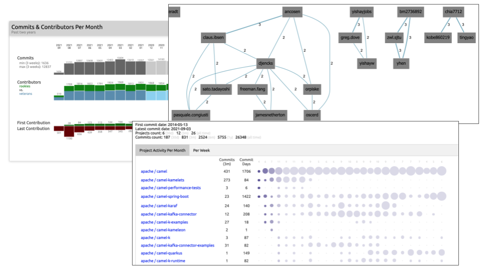
Figure 3:Examples of insights from source code generated with my open-source project Sokrates.
Example 2: Public Cloud Usage
Migrating to the cloud can dramatically increase transparency thanks to uniform automation and monitoring. Classic IT often has limited transparency in its operational environments. Simple questions like how many servers we provisioned, which applications run on them are often tricky and time-consuming to answer.
Figure 4 shows the anonymous screenshot of the Cloud usage explorer, a tool I built to visualize automatically-collected data about the Google Cloud Platform (GCP) usage.
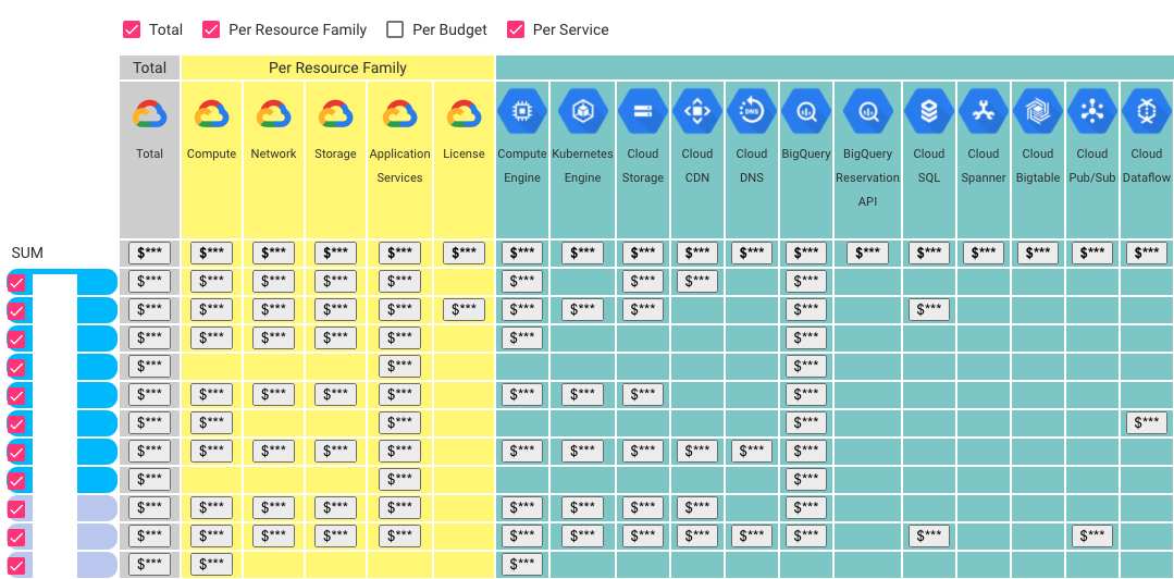
Figure 4: An example of an cloud usage explorer.
Google, AWS, Azure, and other Public Cloud Providers give detailed data about which platform uses which services, resource family, budget. You can also understand which people and teams have access to each service. It is possible to get real-time information about our cloud usages and understand the trends in a fully automated fashion.
Example 3: Financial and Vibrancy Data
Finance departments are very data-driven and have high-quality data that could be very relevant for architects. In addition to standard costs, budgets, and other pure financial data types, I frequently found that finance teams also have different data sources such as vibrancy or usage levels. These teams need such data to, for instance, correlate finance performance with usage levels. Such usage data are beneficial for architecture discussions. For example, linking usage levels and vibrancy of systems with their public cloud usage can identify areas of improvement and inefficiencies.
Principles Behind Data-Driven Documents
In general, the main driving principle behind my vision on data-driven documents is “reducing subjectivity by use of data and insights.” I follow several guiding principles (Figure 5).
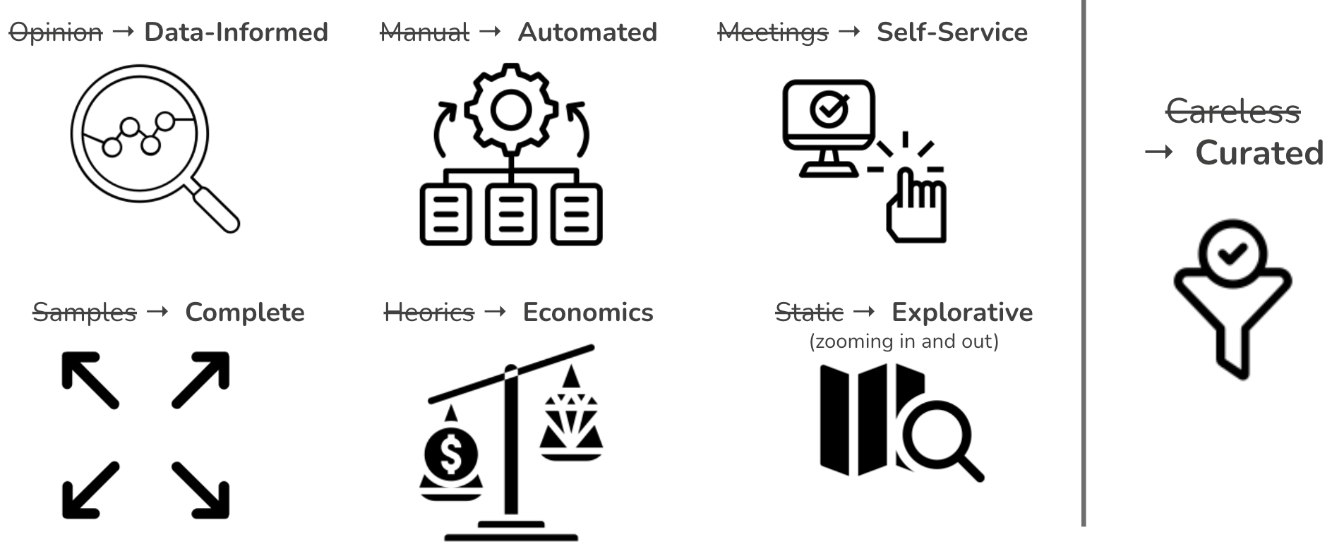
Figure 5: Design principles behind data-driven documents.
Firstly, my goal is to move architectural discussion as far as possible from opinion battles to the domain of data-informed decision-making. Opinions have their value, but we do not need to debate which cloud resources or programming languages we use. We have reliable data for it.
Second, automation is the key to keeping documentation up to date and getting the data repeatable and reliable. While some manual actions may be required, most data-driven documents I created automatically updated daily or weekly.
Third, I build the apps as self-service web applications to enable people to get any data themselves, rather than scheduling meetings and workshops to get and align the data. Whenever I created some of these apps, my schedule became more relaxed.
Fourth, documents must be as complete as possible, based on high-quality and curated data sets. On a scale of big organizations, a sample of data, e.g., cloud usage of one team, may not be representative and is practically useless and misleading.
Fifth, my goal is to use data-driven documents to make architecture function an economic-risk modeling exercise. We should look at data to understand the current situation and create models to simulate scenarios. In this way, I want to make architecture less heroics, in the sense that architects jump in the last moment to prevent disasters based on their internal knowledge and insight. That heroic typically means that we have not looked at the data on time.
Six, I always build data-driven documents as explorative applications, enabling filtering of data and zooming in and out of details. Different stakeholders have different needs, and the one-fits-all model cannot help everyone. Having exploration abilities enables a broader set of stakeholders to get relevant insights. For example, source code analyses can point our some CTO-level insights, such as programming languages trends and inter-team collaborations. At the same time, these tools enable individual developers to zoom into details of their systems and, for instance, get refactoring recommendations and code samples of complex or duplicated code.
“Excessive complexity is nature’s punishment for organizations that are unable to make decisions.” - Gregor Hohpe
Lastly, curation, the act of selecting, organizing, and looking after the data, is the crucial ingredient of the process to prevent creating useless, too detailed views. Curation means choosing what to include and exclude, ensuring data correctness and completeness, and engaging users to make documents helpful. Instead of carelessly bringing together all data we can find, we can add much more value by carefully choosing data and thoughtfully organizing documents. For example, source code analysis can automatically scan all repositories. Curation can increase the value of these analyses by grouping or tagging repositories to create sub-views, e.g., per technology or domain.
How To Build Data-Driven Documents?
While I do not want to prescribe the best technology, I can tell what I use in daily work. I build most data-driven documents as single-page web applications, taking data from JSON files hosted on a static web server. I usually use the latest version of Angular and the Material framework in my current work, hosting the app and data via GitHub pages.
See some of my public tools to illustrate how I build such simple web apps.
Using Data-Driven Documents
Data-driven documents can provide lots of data. Sometimes, as in an ordinary map or atlas, such data could directly be helpful for those who want to orient themselves and understand the context. More insights could be obtained from such data. However, it requires active effort to find ways to interpret and use data. In other words, the documents can give you the answers, but we may not know the questions. Here are some of the questions I frequently ask and answers with data from the documents:
- Are we going in the same direction? Tools such as source code overviews, public cloud usage explorers, or tech radars can point out differences and trigger discussions.
- Are we using technology optimally? Comparing usage trends between teams can show interesting outliners (both positive and negative).
- Are there indicators of poor code quality? Too big systems, duplication, long units, long files.
- Productivity: is more more or is more less. For instance, comparing the number of git merges with the number of developers can indicate if our dev processes are scalable. When we scale up teams, we want to speed up our delivery (but if team structure is not right, it can easily be the opposite as people “step on each other toes”).
- Do we collaborate in the way we want? Repository analysis can point out team topologies and (un)desired dependencies.
- Do we work on the things we want? We may want to focus more on innovations, but in reality, we may spend too much time on legacy maintenance.
Summary
This article summarized my experiences in replacing classical architectural documentation with curated data-driven architecture documents. I presented some of my lessons learned in solving the problem of getting a complete, up-to-date picture of critical elements of technology landscapes of big organizations. Data-driven documents generate multiple views on relevant architectural topics based on data sources such as source code, commit history, public cloud billing reports, and finance reports.
To summarize, the data-driven documents offer an efficient, scalable, and pragmatic way to keep a complete overview of the organizational technology landscape. But as with many tools, they are not the panacea. They need to be a part of processes and activities to impact the organization positively.
I consider the data and transparency, together with architects, to be two main pillars of any technology governance (Figure 6). Data and transparency provide a basis for data-informed decision-making. People and communities enable governance to have an impact (read more about this pillar in another post). Without these two strong pillars, the architecture becomes an abstract ivory tower exercise.
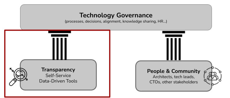
Figure 6: IT architecture relies on two pillars: transparency and community. Data and transparency provide a basis for data-informed decision-making. People enable governance to have an impact. Without these two strong pillars, the architecture becomes an abstract ivory tower exercise. This article focuses on transparency.